Background
My team and I were set the task of rebranding Queensborough Community College, a 16,000-student strong college located in Bayside, Queens, and part of the City University of New York (CUNY) system. The previous identity was established in 2007.
The Challenge
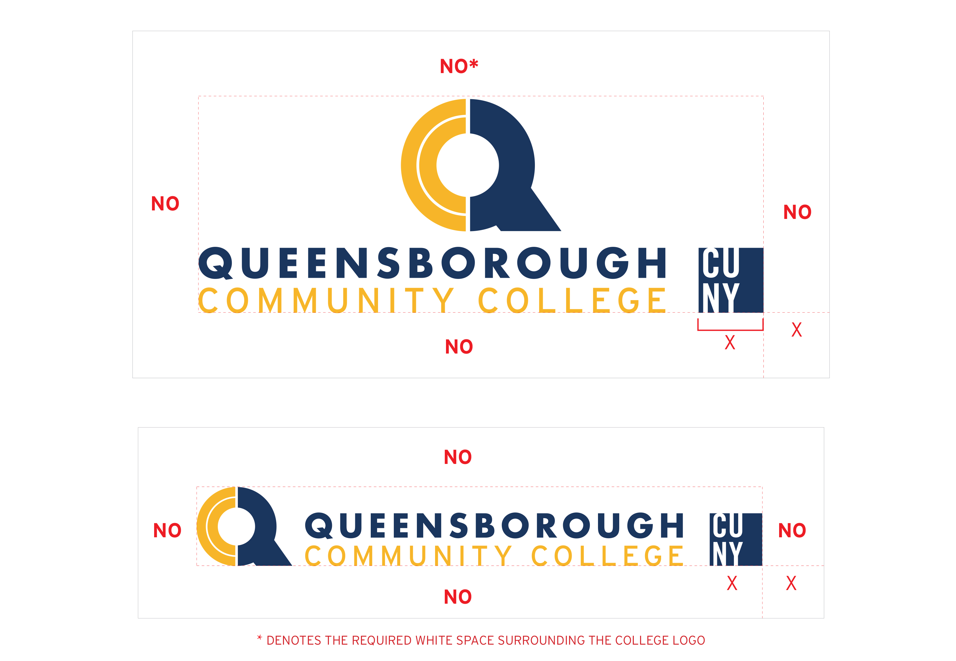
The major challenge we faced in our rebranding effort was the name of the school. "Queensborough Community College" contains a LOT of characters. The old logo, which was simply the College's name laid out in Trajan, didn't work well on smaller screens or with social media platforms like Twitter that require favicons.


Result
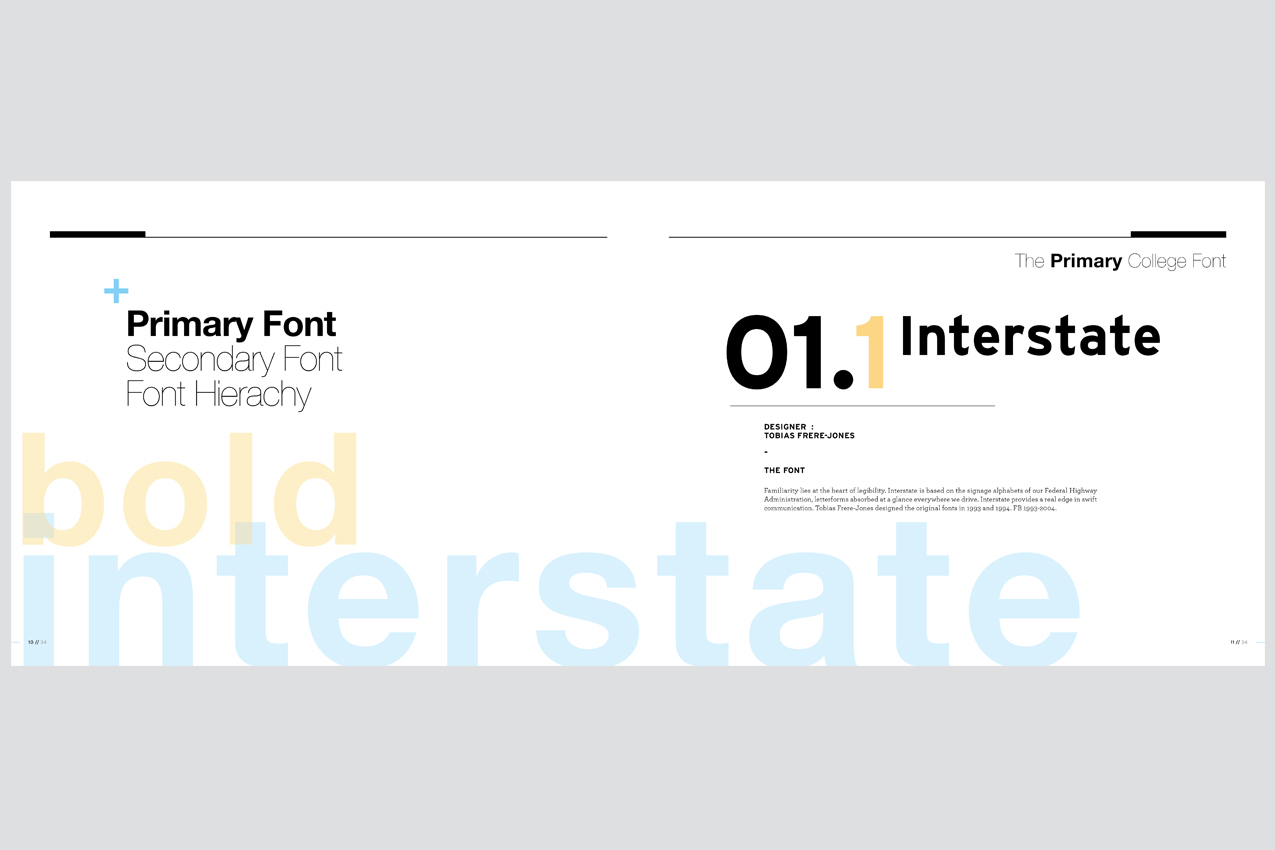
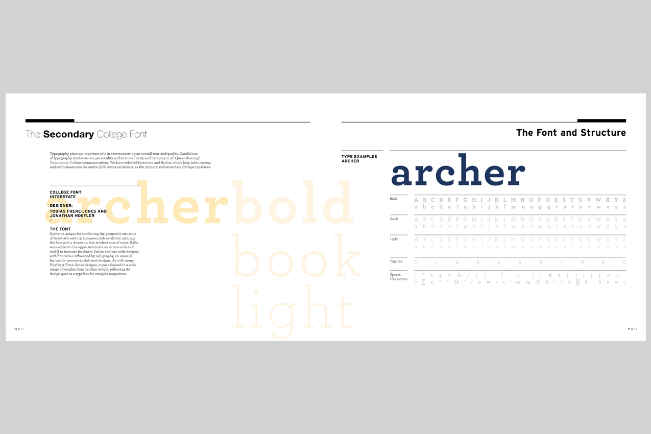
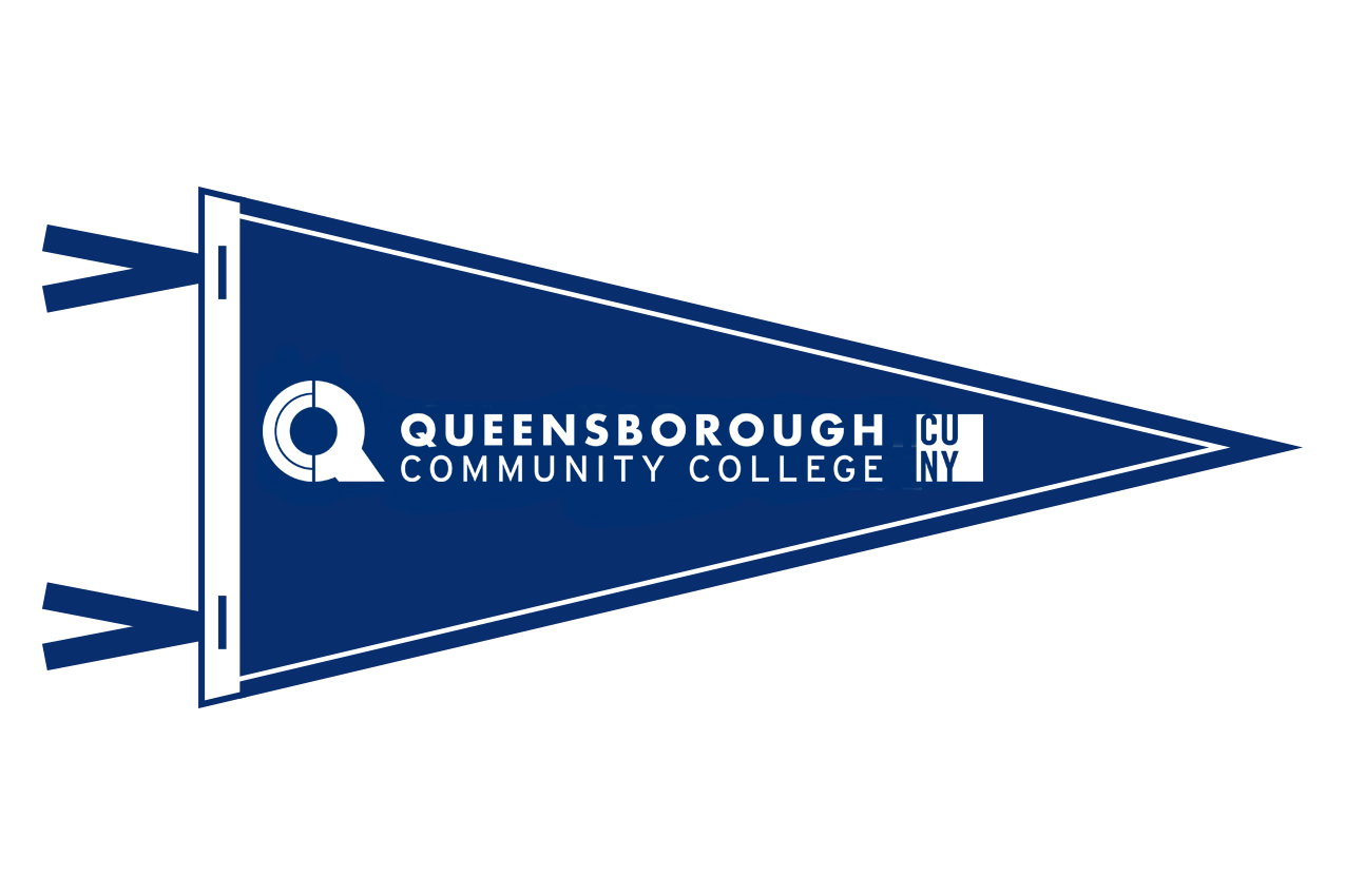
Our solution was to update the fonts used for the school (we chose Futura and Interstate for the logo, and Interstate and Archer for all College collateral) and to create a unique icon that was simple and modern but still felt academic. The new icon is built from the letters QCC. It scales exceptionally well and works perfectly as a mobile or social media favicon/icon. We chose the colors Midnight Blue and Warm Orange since they are complimentary and are not a huge departure from the blues and yellows that the College previously employed. Pictured above: The 2018 Annual Report cover with the new logo "in action."